|
The artwork around the Metal Slug franchise is jawdropping to say the least, with beautiful
looking sprites, amazing sceneries and much more. |

In Metal Slug, there's 3 pillars that constitute the game's spritework itself, which are:
1. the Shaping
2. the Coloring
3. the Shading / Details
Those 3 are equally valuable in making any sprite, and are also used in other forms of pixel art.
(I would have loved to also discuss backgrounds, but they are simply too intricate and
personalized to really break down the development process at the moment.)
Before talking in depth about the artstyle, here's a few recommended
tips and tricks to help you through your sprite making:
- Use references
References are frequently used in art, so don't be shy to use some to help you with your design or to replicate the MS style!
- Learn the general anatomy/physiology of the human body
This one is essential for character design, since it'll help you design more quickly and accurately. This might seem
like a turn off to learn this (trust me, I know), but once learned, you'll be able to play and tweak with your design
much more. This knowledge is as important in pixel art as it is in all other forms of art.
- Have a good understanding on perspectives and shading
Perspective-tweaking is a staple to MS's art design, being able to twist a linear design into a beauty of art, while
understanding how shades works will help out in the late stages of spriting.
- Have a proper space to work with
Simply make sure your workspace is big enough for you to house your designs, references, etc.
If you're interested, I've made a custom spriting canvas just for that!
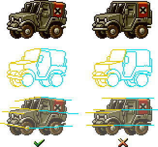
- Check regularly your sprite in 200% or 100% view
It's easy to forget how the sprites look like in their original ratio when constantly zooming and dezooming around
them, so it's important to refresh the view and be sure your design works in the intended scale. Personally, 200%
works the best, since it's closer to the ratios commonly used in emulators and allows the viewer to appreciate the
work.
If your drawing program allows it, using twin windows can be incredibly helpful to compare with the different scales in real-time.
- Be inspired!
Trying to make a sprite without a clear idea or design will often result
in a lackluster result, so take the time to inspire yourself!

The longest part of the process, both for newcomers and hardened spriters!
When starting to make a sprite, you're essentially giving it a shape, which you'll later add in the colors and details.
The main challenge with the shaping is the proportions: Metal Slugtends to almost always exaggerate its designs'
proportions, to fit in with its artistic style (characters having dominant heads, tanks being slightly bigger than
humans, etc.).
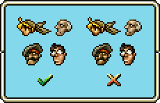
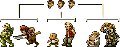
For starters, let's look over the most common body proportions used in
the series for human characters:
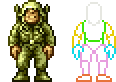
As you can see, the head represents almost a third of the overall body, whereas the arms and legs are the longest
body parts of the character. The neck also stays mostly hidden by the character's head and clothing.
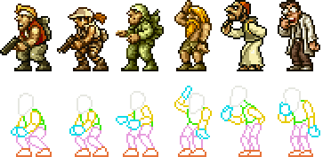
The designs of player characters, enemies and some NPCs are all based on these proportions, with their overall
height varying due to their posture.
Though not all characters follow these general proportions: a handful of them have bigger or smaller anatomy
compared to most human characters.
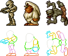
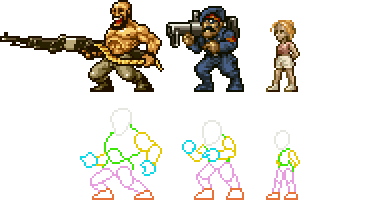
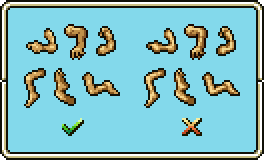
On the other hand, human-based creatures tend to have their own exaggerated proportions, either with huge heads,
lanky limbs, etc. You can basically go all out and not follow any rules if you want to design one!
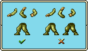
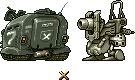
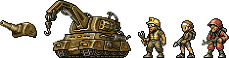
The mechas are handled differently: since the size and proportions are all individually unique, you're much
more free to come up with an unconventional design. Though most common vehicles still are just slightly taller
than characters.
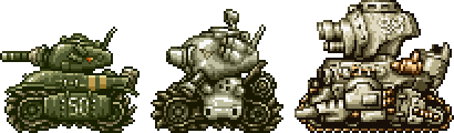
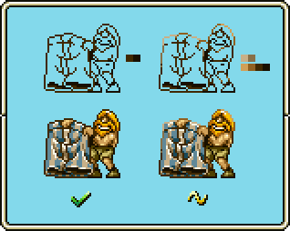
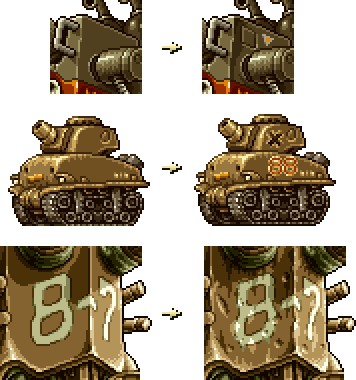
Comparing these 3 tanks, we can see how even though they are completely differently designed, they still have
a particular shape that makes them fit perfectly in the artstyle.

That's because if you look at the major components of these mechas (turret, chassis, treads), they are all
drawn after curved shapes like ovals and circles, giving them this sleek and refined look.

If these tanks were designed with straight geometry, like real-life tanks, it would be painfully obvious how
stiff and unnatural their shaping is compared to the wackier curve-based ones seen in the final games.
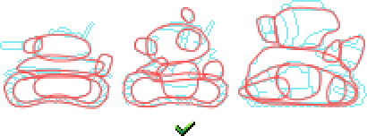
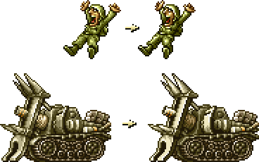
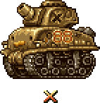
Though not all mechas of the series are seen in profile: lots of them are in a 3/4 view, essentially meaning
that 2 faces of the vehicle are simultaneously in view.
What's exclusive to these 3/4 designs are their warped perspective. We can see that each face is shaped and
twisted by the vanishing lines of the vehicle's perspective. This allows extra space for shading and details,
and above all it gives the mecha a killer look!
Much like the mechas seen in profile, using straight geometry to shape a mecha in perspective simply doesn't
work. The purpose of using perspective on the mechas is to warp the lines, exaggerate the angles and so on.
Keeping the design linear would render the use of perspective nearly useless!

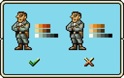
Although the choice of color doesn't seem that important at first, it's still a very significant part of the
process in all types of art. A bad set of colors is like a badly designed UI or HUD in a game: it will stick
out like a sore thumb!
Back in the Neo Geo days, a sprite would usually have a limit of 15 different colors, in order to keep
it simple and effective. Only backgrounds used a high number of palettes (thanks to the tile system, but
that's off-topic).
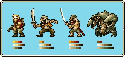
What MS do with these colors is that they typically make set groups of colors in different shades, with
each group applied to specific parts of the character (clothing, skin, accessories, etc.).
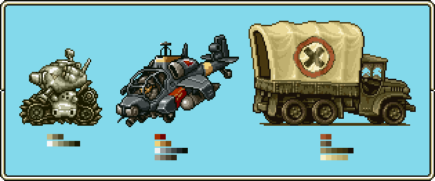
Rules of coloring applied to characters are generally the same with mecha designs, and sometimes have more
varied color palettes.
For example the Rebel soldier has 2 groups of 5 different colors, each getting progressingly darker. All the
color choices flow well together and, most importantly, are contrasted just the right amount.
The outline of a sprite can sometimes uses 2-3 colors instead of just black in certain areas of the body. That's
mainly done to give or remove density from exposed or detailed parts. Max.D calls that the "0.5 Pixel" rule
for fun fact.
While using more colors in the outline can look pretty sweet, the MS games only do this on extremely rare occasions,
such as static sprites. So it shouldn't be the primary go-to way of drawing the outline.
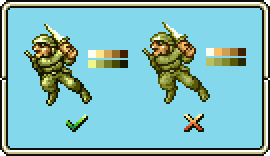
The colors used often slightly change tones between hues, instead of constantly changing hues of a single color
for each palette. This way, it keeps the general color tone from being too pale and unsaturated.
Alternatively, using different colors per hue can add more contrast without relying on increasing or reducing the
luminosity.
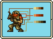
One final note: the colors are often picked to be versatile, meaning that they may be used for not only the goggles of a
character, but also for their pants! The Guerillas are a great example of this practice put to use.
This section is a 2 part method, where one can't work without the other. So let's start with...

What defines the whole artstyle!
The rules of shading in MS are generally the same as the ones seen in other types of art. It's how the shading
is applied that's different.There's a lot of layers to unravel, and that process is always handled differently by
the artist, so bear with me!
Metal Slug developed a certain appealing and consistent practice to shade shapes, and is almost never
changed in the whole series.
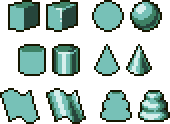
Here's a few basic shapes shaded in MS's style to give you the idea.
Starting with the characters, the shading around their faces should stay minimalistic and clear enough to make out
their facial traits. Adding too much shading will only hinder the traits and the shaping of the head.
The same rules apply to naked parts of a character's body, so that they can look good without over complicating
the shading.
For clothed body parts, the shading needs to take into account the folds of the clothing. This is mainly done by
breaking it up and adding some little details with the colors, essentially avoiding the clothing to look straight
and stiff.
Sometimes when shading large curving shapes, the basic shading technique isn't enough to transition the colors.
For that, 3 different techniques are used to counter that problem, which are:
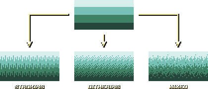
These 3 options are commonly seen applied on bosses, large sprites and backgrounds, which often have to rely on
them to transition colors.
While all 3 can each be used on anything, they still serve specific roles; for example, stroking is mostly used
to shade neat looking curved shapes, while dithering is more used to make the color transitions more seamless.
The mixed technique isn't used as much, but it can still be seen on some gritty-looking mechas.
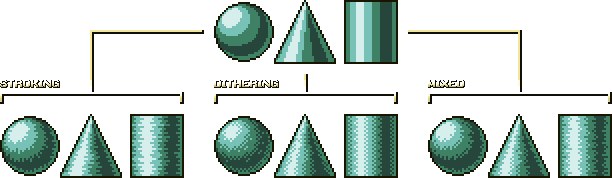
The way the shading looks like when applied with these techniques can slightly differ with the type of shape,
as shown above. So it's up to you to find which technique works best with the surface you're working on.
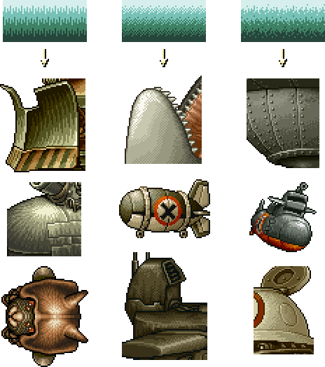
Here's a few examples of sprites from the series shaded in those 3 ways.
One crucial aspect about these techniques is that they aren't suited for flat surfaces.
Only curved ones can have these methods correctly applied to.
If you're looking to fill up space on flat surfaces, further info can be found in the
details
section.
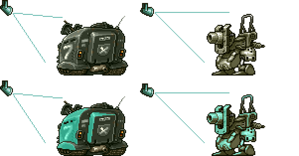
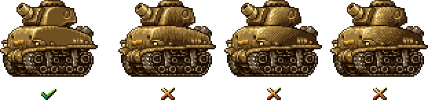
The source of exposition is also important to consider, since it can drastically change the shading process.
This time, you get to decide which kind of lightsource works best for shading the spritework (frontal,
sideways, top, etc.).
Generally with mechas, a single lightsource is used to expose one of the vehicles faces. This way, the shading
can be nicely balanced and proportioned.
It's important to define a clear source of light, as to avoid the mecha to look to uniformly shaded and
lacking in contrast. Under no circumstances should there be more than one source of light used.
If you're comfortable enough with the shading of this style, you can try some more advanced techniques like
shading with stronger luminance. This is used occasionally in animation frames where someone or something
is exposed by a flash, explosion, etc. The easiest way to achieve this effect is to crank up the contrast,
which is done by making the most exposed parts of the body even more brighter, and the darker parts even
darker.

The details are commonly added at the same time as the shading, but can also be created before or after
doing the latter based on preferences. They consist of adding, well, details to your textures to fill in
space or simply add to the design.
While the details you add to your characters are entirely personal, the eyes should follow one of these
3 designs.
For the mecha designs, they are often coupled with these following addons:
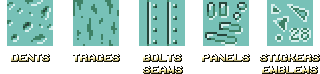
Dents and traces are very common in bigger mech designs, due to their potential in filling in space. The rest
are normally apart of the original design, but can nonetheless be used to also break monotonous space.
Remember: just because there's still some empty spots left, doesn't mean that you have to fill in absolutely
everything. Often times it'll just make an incoherent mess!
To end off this tutorial, here's a few of my personal sprites done with the help of those compiled tips
and tricks. Just to show you what can be done with this tutorial!
In conclusion, this artstyle (like any other artstyle) will always be interpreted differently, so it's
almost impossible to replicate perfectly what Akio, Max.D, and their colleagues did for the Metal Slug
series.
This whole tutorial is merely there to give you the how tos, and from here on you'll have to develop your
own interpretation of the style through raw practice.
It takes a while to be comfortable with this kind
of spriting, so it's important to take it slowly and keep it cool. After all, the whole purpose of learning
an artstyle is to have fun and gently improve your skills.
Thanks a bunch for checking out my tutorial and making it through my ramblings!
And with all that said and done...